Browsing around Etsy, you’ll find plenty of shop banners that are blurry or stretched out. The first attempt I made at a custom banner wasn’t going to win any beauty contests, either. Working with graphics is Greek to most of us, but I’m lucky enough to have a geeky husband to teach me the tricks of the trade.
Follow along as we make an Etsy shop banner for Happy Dog Treats. If I can do it, so can you!

The first step is to get image editing software. For this tutorial I’m using a free PC program called Paint.NET. Mac users can get Pinta, a program based on Paint.NET.
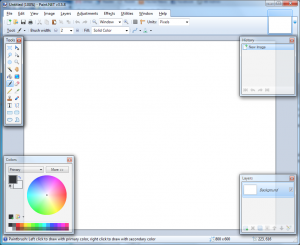
Paint.NET downloads as a zip file that must be extracted to install. Locate the downloaded file and open it, then run the Install.exe found inside to install Paint.NET. Select the “Quick” option for easy installation. After installation, Paint.NET will be launched and you’ll be presented with this window:
The white rectangle filling up most of the window is the canvas on which we’ll draw our image. The canvas that shows up by default is the wrong size for our Etsy banner, so I’ll create a new one by selecting File > New. The New dialog has a section for “Pixel size”, which represents how big the image is on the screen. Etsy’s banners use a pixel size of 760 by 100 pixels, so we’ll enter those in to the width and height boxes, then click OK.

For our banner, we want to combine a graphic and some text on a background. Image-editing programs like Paint.NET have a concept called layers to separate different parts of the image you’re piecing together. Think of layers as transparency sheets from an old-fashioned projector stacked on top of each other in a pile. Looking at the pile from the top, the many layers form a complete image. Layers allow you to work with parts of your image separately, such as moving text around without moving an already-positioned graphic.
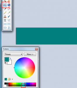
The Layers panel in the lower right-hand corner shows all the layers that exist in our image. Right now, the only layer is the Background layer that is created for us. I’m sticking with the default white background for this banner – if you want another color, select the Paint Bucket from the Tools window and a color from the Color window (shown with red boxes below), then click on the banner.
Once you’re happy with the background color, add a second layer to the image by selecting the Layers menu and choosing Add New Layer. It will show up in the Layers window as “Layer 2” – this is the layer we’ll use for our Happy Dog graphic.
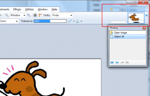
We’re using a graphic from Microsoft Office Online, a great source of clip art for those that already have Office installed. You can also search for free images online – or you may already have a graphic or photo from your shop that you’d like to incorporate into the banner. I’ll open the graphic in Paint.NET, where it will appear in the Image List (shown in the red box below).
The graphic is much taller than our shop banner; we’ll need to shrink it down to fit. Do this by going to the Image menu and selecting Resize. The window that pops up might look familiar, since it has similar options to the New window from earlier. Again we’re going to be dealing with Pixel size. Set the Height to 100 to match our banner size – the Width will automatically be adjusted to preserve the shape of the image. Click OK and now we’re ready to put the graphic on the banner.
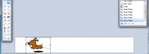
Select the entire graphic by going to Edit > Select All, then copy the graphic with Edit > Copy. Now we’ll switch back to the shop banner using the Image List in the upper right. Make sure that “Layer 2” is selected in the Layers panel, then select Edit > Paste. The graphic can be moved around by selecting the Move tool from the Tools window (the blue arrow in the upper right) and dragging. With the Move tool selected, you can also use the arrow keys on your keyboard for more precise movement.
We’ll create another layer to add the title of our shop with Layers > Add New Layer. Choose the Text tool, which looks like a big T in the Tools window. Notice along the top of the Paint.NET window that once you select the Text tool, options appear for the Font face and size. Choose a font, then click on the banner where you want the shop title to begin. Once you’re done typing, you can move the text around with the Move tool if it’s not quite where you want it.

For the Happy Dog Treats store, we’ll add another layer for the slogan using the same technique that we used for the shop title. By selecting a color from the Color window before using the Text tool, we can use a different color for the slogan.

Now that our shop banner is complete, I’ll save the image. When you select File > Save, the “Save as type” pull-down at the bottom of the window has “Paint.NET (*.pdn)” selected. Choose a file name and save in this format (ours will be HappyDogBanner.pdn). The pdn file will save the layers you’ve created if you edit the image later.
Now we’ll need to save a copy of the file for uploading to Etsy. Select File > Save As; this time choose “PNG (*.png)” from the “Save as type” pull-down and hit Save. Click “Flatten” when prompted – this will smoosh your layers together to form a single-layer image. Pay attention to where you save this image – this is the image you’ll upload to Etsy as your shop banner.
I hope this tutorial helped you create a glamorous Etsy shop banner – leave a comment if you want to show yours off! This is also just a big toe in the waters of Paint.NET, which can do a great deal more than I showcased here. For example, all of the images in this post (including the download button and screenshots) were created with Paint.NET.
Get my latest articles straight to your inbox about once a month. Learn how to improve your Etsy shop, boost your sales and discover other sellers from the Etsy community.
9 Responses
Leave a Reply
« Friday’s Fast Five: Shop Appearance Undiscovered Treasures: Sew Darn Quilt »




I just wanted to say how cool it is you’re using paint.net I love that program! When I didn’t have Adobe it sure did help me a lot. I still find myself a bit lost in photoshop since I’m use to this program but I use Illustrator 95% of the time! Usually when I tell people about this program they haven’t heard of it.
Terri, thanks for taking the time to comment. I am still learning Adobe myself – I learn something new every time I use it!
This tutorial was a lifesaver! THANK YOU sooooooo much! I was thrilled to be able to finally make my banner… couldn’t have done it without you! :o)
Stephanie, glad to hear that the tutorial was helpful!
Thank you so much for this tutorial! I had asked a friend who went to school for graphic design if she would help me out with some designs but have never heard back. I just recently opened my shop and know it needs a lot of work…branding being a major part of that. I set up a Facebook page for my shop and am thinking I might just try to engage those on it by making a couple of designs and running a vote. Again, thank you!!!!
Than you so much for this tutorial! I am NOT good with graphics and I made my own shop banner this morning! You have no idea how happy this makes me!
You’re welcome – glad it was helpful.
This tutorial was so helpful. Thanks a bunch!
Thank you so much! You’re the first person that was actually able to help me figure out this banner issue with etsy and to create a new more lively looking banner!