Jessica of Emilia’s Luxe Linens was convinced that she was terrible with a camera. She felt stuck, thinking she’d need to hire a photographer to get dazzling product shots like other Etsy shops. Desperate for help, she signed up for a shop critique.
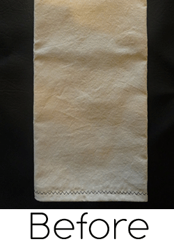
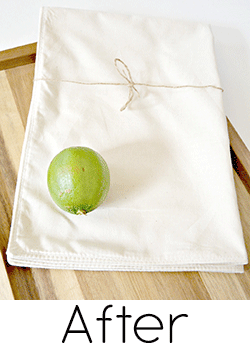
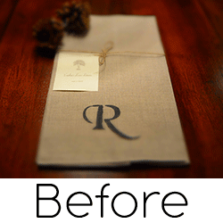
 Practically overnight, Jessica’s photos went from dark, blurry and unflattering to WOW. The before and after shots below will have you convinced she hired a photographer. She must have at least bought an expensive new camera, right?
Wrong. Jessica’s shop critique revealed 4 simple tips that sent her product photography quality skyrocketing. Jessica is still using her husband’s middle of the road Nikon camera, but now she takes stunning photos that tempt buyers into her shop and land her on Etsy’s front page.
The transformation was so unbelievable that I had to share it.
While I knew my photos were not good, it was still difficult to hear how really bad they were.
It turns out Jessica isn’t terrible with a camera, she’s actually really good. She just needed a push in the right direction. Encouraged by the thought that her shop could look like the professional shops she’d seen on Etsy, Jessica put the photography tips to work right away.
Photos at the right time of day
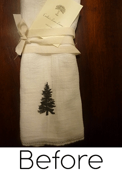
 Jessica was taking many of her photos in the evening, since it was hard to find time during the day. The lack of natural light meant using her camera flash, which caused bright spots in her photos.
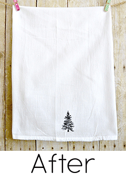
Ditching the flash and using natural light for her photos put the focus on her product, not the unusual lighting. Jessica went to each room in her house during bright parts of the day and scouted for the best conditions. She learned from the critique to find a room not only with plenty of light, but one with light coming in from more sides as well.
She now makes sure to set aside plenty of time to take photos when the lighting is at its best.
Simple product staging tricks
Shockingly, the blurring effect was intentional! I thought it looked “professional”.
Most of Jessica’s shots were taken top-down, with her linens laying flat on a dark table. The products looked a bit lifeless, not to mention blurry from overusing the macro setting on her camera designed for close-up shots.
Jessica bought some white poster board to use as a neutral backdrop, rather than a fabric; the extra sheen from the poster board gives the photos an added pop of light.
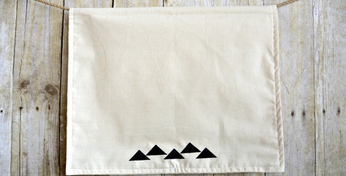
The products in her shop have a simple, rustic feel that she wanted to convey in her photos. Jessica managed to find an inexpensive bulletin board cover that looks like a fence as a backdrop. She hung the towels against the backdrop rather than laying them flat, to better show how the towels look in use.
Staging doesn’t have to be elaborate or expensive. Jessica’s bulletin board cover is a great example – a few bucks well spent. Backdrop paper or a neutral fabric with a light pattern can do the job, too.
Jessica also started adding natural botanical elements like fresh flowers, fruit or dried leaves. She nailed the rustic look that she was going for and made her shop consistent with her overall branding.
Safety in numbers
Professional photographers have expensive studio setups with tons of bright lights to make sure they can consistently take good photos. It’s tougher to get good shots every time taking photos by the light of a window. Jessica learned the secret to getting great shots without the expense of a studio – take lots of photos!
Since natural light and a home studio setup is less reliable, taking 20-100 photos of a single product will increase your odds of snapping that one killer photo. It also gives you plenty of choices for secondary listing photos.
Snap photos until your shutter finger gets tired, then take 10 more. Stand at different distances to the product and try new angles. Without film, there’s no reason to limit yourself to only a handful of shots. Jessica takes at least 25 shots of each item to get a few that she likes.
Brighten, crop, enhance
Why settle for reality? Photo editing software gives you a second chance to improve the shot. Whether you’re adjusting a not-so-perfect angle or cropping out an unwanted part of your photo, you’ll find that your pictures are greatly improved by adding this step to your listing process.
Jessica discovered PicMonkey, a simple online photo editor, through her critique. Picasa is another free tool that makes photo editing a breeze. Both editors even have one-click auto correct for contrast and brightness to take the dull right out. It’s a great way to start out before fiddling with the controls yourself.
Make sure to size all your photos the same so Etsy doesn’t add gray bars to the side of listings photos as customers flip through.
After the critique
Jessica started making changes rapidly after her critique. She was amazed with the photography tips and started taking photos that she never imagined were possible.
I couldn’t make changes fast enough once I knew that there were things I could do to improve.
The upgraded photos made a huge difference for her shop. She immediately started getting featured in lots of treasuries and watched her shop stats slowly climb.
The biggest surprise for Jessica was that she could take these photos herself. Her team members gave her the encouragement and confidence to try her hand at better photography. Jessica went into her critique with an open mind and didn’t take the comments personally, and her shop is so much better as a result.
Six months later, Jessica continues to improve her shop. She views her new product photos as a major accomplishment for a person that hardly knew how to use a camera. She’s proud to have kept her shop’s vision while implementing changes from the critique.
I still have work to do on my shop. The critique was so full of information, it was almost overwhelming. I learned there is a lot that goes into a wonderful Etsy shop, and I still have a lot to learn and improve upon.
I can’t believe how far Emilia’s Luxe Linens has come. I owe Jessica a big thanks for opening up her critique to share the photography tips with everyone.
Get my latest articles straight to your inbox about once a month. Learn how to improve your Etsy shop, boost your sales and discover other sellers from the Etsy community.
52 Responses
Leave a Reply
« Undiscovered Treasures: Sandra Nielen The Foolproof Formula of Successful Sellers »





If you are still offering to critique shops, I would greatly appreciate it. I’ve have had my shop, threadedbobbin.etsy.com for almost a year. I’ve had a number of views but very little sales.
Thanking you in advance,
MarySue
MarySue, I am no londer taking shops for critiques but I did take a quick peek at your shop and I would suggest that you continue to add items. The more items you have in your shop, the better the chances are that you will get found. Being active on social media also can help drive traffic to your shop. If you are interested in a critique from other Etsy sellers, you may want to ask for some advice in Etsy’s community forums.
Hello there,
I’m fairly new to the Etsy shop experience and I would love to get a shop critique. I make felt nursery and home decor. I’m taking a class on fb right now about growing your followers and am realizing how little I know about the social media side of promotion. I have a Canon 60D so I feel a bit ashamed that I am not taking amazing photos with it but part of the struggle is not knowing how to set up backgrounds for nursery decor well, and also in a small apt I only have natural light to use (a large sliding door in our living room). Would really love a shop critique from someone as experienced as yourself.
Thank you so much,
Beth Doner
Beth, thank you so much for taking the time to post. I have all the shops I need currently for critiques but I have visited your shop and think you are doing a great job when it comes to your titles, tags and photos. I think it is great that you are taking a class on Facebook – social media can be tricky but also rewarding if done correctly. I’d suggest adding more items to your shop – consider having more ready to ship items available. Also, you may want to consider shipping Internationally to more countries. You will increase your exposure and your potential customer base that way. Hope that helps a bit!
I recently discovered your wonderful website full of useful information for etsy sellers. I love reading your articles, keep up the good work!
Thanks so much, Vandana!
Hi Brittany – Great Article! Love the before and after results for her photos….
We are a new shop on Etsy and would love a critique on our shop!!! We just opened in December and are currently considering switching to a lighter background for our pics as many shops on Etsy currently do. However, we like the feel of the antique pieces we use in our shots. Any feedback would be greatly appreciated.
Thanks, Lynn
Lynn, sorry I somehow missed your comment. I apologize for the delay in responding. I’d say play around with different types of backgrounds and shots until you get something that really reflects your shop and displays your pieces in the best way. It is important to listen to your gut in terms of what feels right for your shop. I’m still working on improving my photos and fine tuning my branding after 5 years on Etsy – it is an ongoing process.
Love the article, very helpful indeed. I struggle a lot with photos; I am improving, but I would love your advice!
Eleni, thanks for the kind words and for taking the time to post. I have all the shops I need for critiques now. I will say that I think your photos show great improvement. My advice to you is to make sure that you fill out your About page following these guidelines from Etsy.
Hi! I would love a good honest review of my shop. I have read so many articles and tips on how to improve but i don’t seem to be getting anywhere. Help! https://www.etsy.com/ie/shop/TheQueenBeeShop
Hanora, thanks for posting! I have all the shops I need currently for critiques but I have visited your shop and think you are doing a wonderful job of bringing your two passions, flowers and books, into your shop. I especially appreciated reading your About page! Keep creating, keep reading and keep listing. Best of luck to you.
Wow, my head is abuzz with the info I just read here! I started out using a natural linen/embroidered fabric background on my photos, and I love that. I was worried that it was amateurish, so experimented with just the natural linen, and more recently, a white backdrop. I have also struggled with a way to show proportion on the tiny dolls without making them hokey looking. Sales are awful. I recently added the fascinators and hope I can improve sales by getting the right people to see them. I would LOVE a point in the right direction if you have time to give me a nudge with a critique! Thank you! http://www.shirleysgirlies.etsy.com
Hi Brittany,
I am a person who takes critique hard, but for the etsy shop I’ll be actually thrilled if you can take a look 🙂
(I’m running the shop only in my spare time between my full time job and a kid, just to help my dad with his hats sale, That’s an excuse but I do not have as much time for reading about Etsy and learning how to do it right as I would like to!) Appreciate your feedback- any feedback.
And thank you for the treasurybox – you probably heard that before but you really made thousands’ people’s lifes easier! Thanks 🙂
Sylwia
Sylwia, cute hats! My first recommendation is to create an About page. Since you are not making the hats yourself, you will want to clearly identify the maker and explain the role that you play in the shop. I think your photos are really good. You may want to consider adding a bit more breathing room around the hats that are not taken on a model so that the full hat is shown in the thumbnail picture. I think your prices are VERY reasonable, you could even bump them up – especially since you are offering free worldwide shipping on the winter hats. I will keep you on the list for a possible critique if one of the other shops on my list falls through. Best of luck to you and your dad!
Thank you so very much Brittany!
I will take some photos of my dad making hats when I visit him for Christmas and will update the About page.
Good comment on making full hat visible in the first picture, I’ll re-adjust some of my pictures.
many thanks again for sharing your knowledge and views!
Hi Brittany, I’ve tried to improve my photographs but I feel like I am getting worse not better! I make roughly the same sales every year with less and less people visiting the shop. Any help you can give me would be greatly appreciated. I know I need to make more effort but since I hand make every new item in my shop and do no castings, there seems no time left to promote it!
Helen, you are on the list for a critique. One small thing that that you can do quickly and easily is to connect your Facebook page to your Etsy shop. On Etsy, go to your Shop Settings; under Info and Appearances you will be able to link these up.
Thank you very much Brittany….. I’m really looking forward to my critique!
Great photo tips. I was just taking some today. I’m trying for a neutral background for my new beads. I’ll be able to edit tomorrow. I love photography. Jessica’s new photo look great! Way to go.
A shop critique from you would be fabulous! My business niche is Custom Made which I will always offer however I just recently started experimenting with adding some ready to ship items. I’ve operated my shop mostly seasonally in the past but now want to expand to full time. This would be the perfect time for a critique for me and my shop.
Pam, ready to ship items will really open up the world to you and your shop. The outdoor photo on your personalized Halloween bags hits the right notes; the models make it personal, it’s cropped just right, and the natural light fends off the dull grays. The pillows are fabulous, but they need a more natural setting and lighting.
I would give your items a little room to breathe – the close cropping ends up cutting off some of the item in the shop view. Cropping all photos to the same size will keep the gray bars off the listing photos too.
Brittany, thanks for your comments and suggestions. I will continue to work on better photos.
Wow, what a makeover! I would really appreciate your shop critique. I especially need help with SEO. I am currently trying to find my “style” for photography, as now I have dark backdrop photo’s, white backdrop photo’s, photos with and without props, beach photo’s and more. Any advice would be so helpful!
Meri, I think your photos are just gorgeous – I love them! There’s a lot to be said for a clean, white background – but in your case I’d avoid it. Your props and backgrounds are done so tastefully that it really brings out the best in your products. I don’t see any big SEO problems in your shop; one thing to consider is adding links to shop sections or other like items in your descriptions. I look forward to seeing your shop thrive!
Thank you so much Brittany!
I love the look of “branding” Emilia was able to achieve with her backdrop. Fabulous photography tips, I too take about 100 shots and play with pic monkey. I would appreciate any advice I can get for my photos. Thank you for sharing this information.
~ Cindyanne
http://www.MoreFriendsAndCo.etsy.com
Cindyanne, I’d recommend finding a consistent backdrop for your photos – it would add a sense of cohesion to your shop, since you have such a variety of items. Continue to experiment with different angles and photo editing. Your outdoor photos have great natural light!
WOW! Very helpful tips once more! I would LOVE a shop critique we are not getting a whole lot of sales to be honest and I’m a little at a lost to what to do about it! https://www.etsy.com/ca/shop/VCollectionOnEtsy
Valérie, my best suggestion for now would be to continue adding more items to your shop – more chances to be seen by potential buyers.
Thanks so much for all the support and information you provide for our shops. Every tip helps to move us forward. The tips in this article seem so simple, but if you haven’t been using them, they can really transform the shop from blah to fabulous!
I recently discovered FotoFuze which is another easy way to lighten up backgrounds for a shot gone not-so-good. I went from using a fancy-schmancy studio set up to just a window and my iPhone, with wonderful results. I still use a studio photographer for the models, but for something I want to post immediately, my own shots work great. I would love a critique!
https://www.etsy.com/shop/TurbanDiva
ps – I’d be lost without TreasuryBox!!
Thanks for posting the great tip, Laurie. I didn’t find much to critique in your shop, you’re doing so many things right that it wouldn’t make much of an article. I wish you continued success!
I’m always searching the forums for ways to improve our shop and as a result I just found you here this morning.
I was immediately excited and inspired and knew that the best thing I could do would be to start at your latest article and read everything from there!
The transformation in Jessica’s shop is incredible and I wish her much success with her beautiful linens. I love the way her shop makeover ties her product and images all together. Her shop looks very professional and branded. I peeked at her sales to see her early photos, and the contrast is simply amazing.
I also struggle with photos which is evident from browsing through our shop. I am constantly, Constantly working to improve photos, title, tags etc.
You can only imagine my excitement when I read your invitation for a shop ciritique and we would be so grateful if you would visit our shop for consideration.
In the meantime I will read and study everything you so generously offer here at Brittany’s Best.
Thanks.
~Violet~
https://www.etsy.com/shop/GaelicForge?ref=si_shop
Thanks for the kind words, Violet! You’re on the list for a future critique. Meanwhile, I’d recommend adding an about page for your shop to build a connection with potential buyers.
Brittany, thank you SO MUCH! I am to the moon with excitement! And thank you for giving me something to start with, the about page is now at the top of my To Do list and I will start work on it.
With much appreciation and my best regards,
~Violet~
Hi Brittany,
Just wanted to let you know that I have completed my assignment!
I’ve created the About page for our Etsy shop. It may need some tweaking so I’ll leave it as a work in progress. I have a thumbnail of Ted and myself and business related photos will be coming.
Thank you and thanks for sharing such an informative blog with us all!
~Violet~
Love her new look, what a clever way to achieve the rustic background without dealing with a chunk of real fence. Thank you for sharing.
We love the Treasury Box app for Chrome, such a time saver & your customer service is the best.
We would love a critique. While I am not thrilled with our photos, they fit the Etsy white background for jewelry photos, I think they are a bit sterile, but it focuses on the product. My point & shoot camera died & we inherited a DSLR which I am trying to learn before listing more items. I think our weakest point, besides lack of inventory, is our tags & SEO. I am currently helping in out at our shop at the Bristol Ren Faire in Wisconsin, so I get to hear the customers comments. People love our items when they see it, but I don’t think they would do a search for an item that looks like ours. They never know what it is made from when they see it in the shop & even after explaining the materials to them, I don’t think some of the fully understand.
James is doing demonstrations at the shop, which helps them understand the materials & the labor that goes into each piece. I hear words like wow, sooo beautiful, ooo shiny, oh my, etc., but I don’t feel those are searchable tags. Currently we are driving most of the traffic to our Etsy shop from our Facebook page & our shows, which is not a bad thing, but we would love more traffic from specific item searches. Any suggestions would be appreciated.
Our shop is here: https://www.etsy.com/shop/IndigoTurtleArt
Carole, the process shots on your about page are awesome! I’m going to pick on the first item in your shop (perhaps unfairly) – I’d really like to see the porcelain boxes split apart into different listings for each color. This one listing has 12 different products shown, it’s a bit unsettling. I’d recommend experimenting with categories – I’d expect this one in Weddings > Decorations to hit the ring box market.
The white background isn’t necessarily a problem – as you say, it’s very common on Etsy and Google even recommends it for listings in Google Shopping. I have you on the list for a potential shop critique!
Hello Brittany, Thank you so much for the compliment & the input. The listing showing 12 of our miniature Treasure Boxes is a wholesale listing for a dozen pieces, we have 3 shapes in 4 different colors. We have 3 additional listings for individual boxes, these are listed by shape with a drop down selection for color. They are our biggest seller on Etsy, most going for Tooth Fairy boxes. Both our international sales were these boxes going to little girls for their loose teeth. I will review our categories per your suggestion, thanks so much!
Carole
This is a wonderful and inspiring article. I really appreciate so much you sharing this. I knew summer would be a slower time and that is when everyone says to revamp your shop and make it perfect. I do not know where to begin. I do this full time and actually have other Etsy shops too, this one was doing well and then not at all. I would love a critique to have some direction. I just ordered a photo shoot backdrop and lighting, so hope to improve photo quality. Thank you again, here is my link. https://www.etsy.com/shop/VintageIronworks
Kim, industrial lighting is trending on Etsy now – your new backdrop and lighting should help, flash can really kill a good photo. I’m concerned that you have the same item in multiple shops, if they both show up in search results one might jump to the conclusion that you’re a reseller. I’ll keep your shop in mind for a future shop critique!
I love the new look of Jessica’s shop! I flicked through her past sales to see the old photos and the change amazes me, I cannot believe she still uses the same camera! I especially love the photos with the wooden backdrop.
My shop is almost exactly as old as Jessica’s and I have almost the same amount of sales. I was wondering if I could have critique? I love photography and I try to do beautiful photos of my items, I also try to ‘socialise’ – I favourite other shops and items, create lots of treasuries, participate in teams, I’m on FP a fair bit. But still I cannot get to 10 sales per month (my goal for now). Maybe my tags or descriptions are the problem because English is not my native language. Maybe I need to do more marketing through facebook/instagram? Maybe I need more items? I honestly don’t know and I would like to recieve some critique. Thank you in advance!
Tatiana, I love your shop! You’re on the list for a future critique; in the meantime, I have a few suggestions. You have stunning photos, but many of the first listing photos are top-down. I’d focus more on the three-dimensional angles since that’s what sets your product apart (like the third photo on this listing).
Your tags and descriptions are great – one suggestion is to use ‘birthstone’ and the appropriate month in your tags instead of ‘zodiac’ and the zodiac sign. The sign more often refers to the symbol or animal than the stone. Search for ‘scorpio earrings’ on Etsy and you’ll see what I mean.
Thank you Brittany!
Good point about zodiac signs, you’re absolutely right! I’ll stick to the “birthstone” tag from now on.
Also, thank you for the tip about the photos.
I think I need to review all my listings actually as I haven’t done it in a long time.
Thanks again!
Fantastic transformation on this shop! Very inspiring. Great article.
I would love a shop critique! I have been selling vintage clothing for years and have really enjoyed the experience. However, lately sales have slowed and frustration is beginning. I would appreciate any little advice you have to offer!
Charli, I love your style – and that your shop is targeted narrowly to vintage fashion and accessories. Some vintage shops are so scattered that it’s hard for a shopper to feel at home. I notice you have the condition of the item on some listings but not others; I’d recommend adding it on all of them so buyers aren’t left uncertain. You might also think about expanding your descriptions to sentences instead of bullets, telling more of a story behind the items.
These are fantastic tips! I would LOVE a shop critique. I’m having a really hard time with branding, the design of my products, and the photos. Not sure what look to go for, especially with my photos. Props, no props, consistent backgrounds in photos, or mix it up? I really want to pick a direction for my shop and run with it. Any tips you could give would be much appreciated. I take criticism really well.
Melissa, I think your photos are a cut above! To help with branding, I’d love to see one of the listing photos packaged (assuming you label or wrap the soap with your logo). You’re on the list for a future critique; in the meantime, you might focus on adding information about the types of soap you sell and the process you use to make them.
Thanks Brittany! I’m taking a new approach on my photography now and adding botanical props and so far I really like the new look. I have plans to make photos showing the new packaging in the future. I’ve been testing out different label designs and packaging and think I may have decided on something I want to stick with. I haven’t taken packaging pics in a while because I’ve completely changed my packaging and designs recently, so once I’m for sure I”m sticking with the new look, I plan to take some photos. Thanks for your advice!
Melissa
http://www.gingergreysoaps.com
Forgot to mention, your Treasury Box feature is awesome! I don’t know how I made treasuries without it. Actually, I didn’t because it was such a tedious job, but I can easily make several treasuries a day now with ease. This is an Etsy must have in my opinion! Genius!
This is absolutely incredible! I almost can’t believe the before and after shots are from the same shop. Congrats to Jessica on all her hard work and this amazing transformation. 🙂 Her story definitely gives me hope for my shop and my little point and shoot!